Brand consistency really does matter (aka are your logos a mishmash?)
Take a look at your email signature, Teams background, the fonts you use in documents and presentations. Are your colleagues using the same style and colours?
If not, your company may be sending mixed signals without you even realising it.
The importance of consistency across all of your communications, including your website, social media and wider marketing materials shouldn’t be underestimated.
Without it, your business can appear disjointed and unprofessional, which can negatively impact perceptions of you among your target audience.
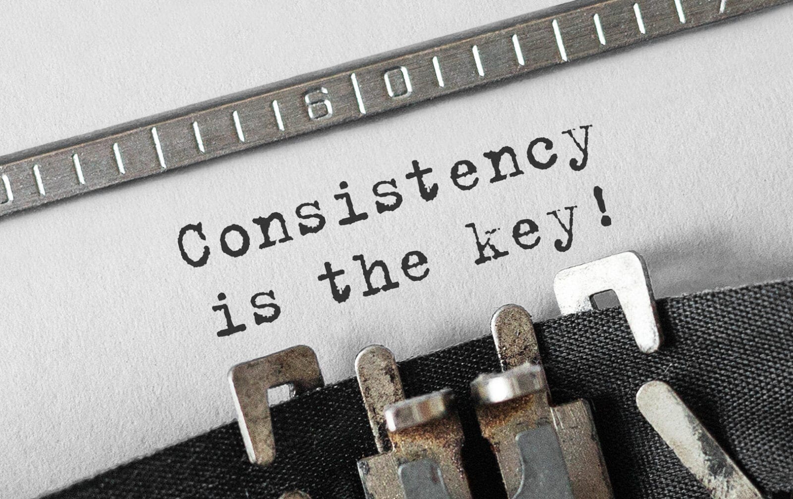
A clear and consistent visual identity, paired with a simple core message, helps people recognise and remember your business. It builds familiarity … and familiarity builds trust and confidence.
The good news?
Reviewing your branding doesn’t have to be a huge, time consuming and complex mission.
Often, improving consistency is simply about reviewing what you already have and harmonising everything in a straightforward and practical set of brand guidelines – a simple document that makes it easy for everyone in your business to follow the rules and stay aligned.
PowerPoint presentations are a classic example where branding can go awry. All too often, personal preferences creep in and random fonts, colours and layouts are introduced (Canva has a lot to answer for!).
Seemingly small inconsistencies quickly add up. Sticking to agreed brand rules isn’t about curbing creativity, it’s about presenting a united, professional front.
Over the years, we’ve noticed that brand inconsistency is far more common in fast-growing businesses, where the focus is on delivering work. This can create confusion as a business scales and ultimately lead to greater costs when the penny drops and the time comes to reset everything anew.
Here a are few questions to ask yourself:
- Do you and your colleagues use the same email signature format?
- Is your logo always presented the same way?
- Are your company fonts and colours used consistently across stationery, documents and presentations?
- Does your website look like it represents the same company as your social accounts?
- Would a customer instantly recognise your brand across different platforms?
If you’ve answered no to any of these questions, it might be time for a quick brand audit and refresh.
Don’t panic that you might have a stock of stationery that might become outdated – despite what you might think or been told, bringing consistency doesn’t necessarily mean everything being brought into line on Day 1.
Start with the things your customers, clients and prospects will see most of – your emails, social posts, website and presentations. Everything else can follow over time. Old stock can be fazed out or used as scrap.
If the way your organisation presents itself is in need of some TLC, we’d love to help.